Talk about anything and everything not related to this site or the Dreamcast, such as news stories, political discussion, or anything else. If there's not a forum for it, it belongs in here. Also, be warned that personal insults, threats, and spamming will not be tolerated.
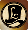
Can you guys tell me what you think of this design, i was screwing around trying to make a tattoo of my initials and made a design i thought was pretty cool and id like on clothing. I made a few designs and i want to know what people think.
If you guys could let me know what you think of those two designs thatd be great.
I ask that if you would like to use these or send them to someone that you do not edit them in anyway and have my permission.
I actually disagree. The first one doesn't work, because the text beside the lettering doesn't go well. When designing a logo, you always want the logo to stand on its own, and not have the name try to integrate with the logo. Here we have a wonderful organic logo that is nice and flowing, lot's of energy and movement, but we have text beside it that draw us away from the logo and stop dead. We cannot appreciate the quality of the logo because the text beside it requires us to make a connection with it and the logo, and our ability to view it objectionally is ruined. And even if, for a minute, we do not consider this fact, the font that you have chose to use for the textual part of the logo does not match the wonderful flowing letters that makes up the logo. Obviously, you have chosen this for readability reasons, which is fine, but the first word does not even come close to matching or lining up with the 'S'. It looks like a word in itself, seperate from the 'S', which obviously hampers readability more than mimicing the typeface of the logo.
Now the second one works better solely because the text is not integrated. It is a seperate entity, and works well syncing up with the logo below it. The curviliniar elements match fine with the logo. That works great, and is what you should have done on the first shirt. Now, as for the symbols in the back, I can see how that would work. The flowing text with the motifs in the back give it a very Victorian look, going along with the advancements in printmaking in the late 1800's. The text reminds me of a early chromolithography design along with the motifs filling it. This could work, but unfortunately does not in this piece. The reason is because of the negative space. The motifs integrated with the logo are too spaced appart, and contain many fine lines that begin to break up the design. The large white spaces become the only element that is solidifying the logo, which means it's drawing too much attention to itself. Your best bet is to either incorporate many, many more symbols and put a nice thick outline around the inner text to hold the image together, or place the symbols in the background and keep the logo plain. I honestly cannot say which would work better. It would just be trial and error. However, the modern spin on a Victorian style is a good homage in a humorously ironic way.
Yup, just take the second design but leave out all this signs which are in the logo.
You feel at ease as you flock with the masses,
What do you see with your heads in their asses?
Keep on railing at what I believe,
Call me insane and I am proud to be.