Here are my ideas. The first menu is heavily based on DCSteve's. Remember these are overscan permitting so ignore any "blank" stuff at the sides.
I understand there is a lot of transparency and other visual effects in here that probably won't be possible, so of course if this layout were to be used I'd obviously tone it down and work around when necessary.

The first thing the users see

I've been informed that buttons are out and instead a commercial game style system is being used, where the user highlights options with a directional pad instead of pressing buttons - so you can ignore the A B X Y on there. I'll probably change those to icons relevant to the option, like a disc for the load or whatever.
Notice how there is a game showing through. This would only be there if the user brought this menu up with a game in the background already playing.
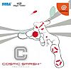
I do have this also with an old-style Genesis era Sonic. However the picture wasn't as good quality.

Self-explanitory...
but notice how there's no background here. If the user was playing a game already and selected the Play Game option, perhaps the game could be unloaded from memory to make the selection process as fast as possible. Of course, if memory allowed - we could keep the background..
I want to add something to that big gap in the top right though. Just a simple picture of a CD might work well.

Selecting gives this additional info if available. After that users press A or start to begin playing.

When there's no disc in the drive...

Credits could scroll if there were enough of them...
This would all be animated also. Nothing static!!!
I'd like to put a slowly strobing spotlight in the background when there was no screen shot showing through - either using alpha transparency (correct term?) or old fashioned stippling. There'd be no sharp jumps from one screen to another, just very fast fades and things rearranging around the screen. For example on the ROM Loading screen the box on the right would quickly slide in to view.