http://cool.lindata.se/pic32.jpg
What do you guys think of this one?
-
Coldwinter
- DCEmu Freak

- Posts: 63
- https://www.artistsworkshop.eu/meble-kuchenne-na-wymiar-warszawa-gdzie-zamowic/
- Joined: Tue Jun 25, 2002 4:54 pm
- Location: On the Top of a Icy mountain
- Has thanked: 0
- Been thanked: 0
What do you guys think of this one?
now i dont want you guys to say that looks really good n stuff like that i wanna hear where all the errors is 
http://cool.lindata.se/pic32.jpg
http://cool.lindata.se/pic32.jpg
Criticism Makes you a better artist then u can see where u went wrong
Hmmmm i wonder where that came from.......
http://cool.lindata.se/coldwinter/

Hmmmm i wonder where that came from.......
http://cool.lindata.se/coldwinter/
-
Narcissus
- TAFKA Token99

- Posts: 1997
- Joined: Sun Jan 27, 2002 1:16 pm
- Location: The mirror. | .rorrim ehT
- Has thanked: 0
- Been thanked: 0
- Contact:
Re: What do you guys think of this one?
that looks really good

heheh, it's all personal opinion. I don't see anything "wrong" with it. It's a creation/cartoon that you've made, it can look however you want it to look
heheh, it's all personal opinion. I don't see anything "wrong" with it. It's a creation/cartoon that you've made, it can look however you want it to look
The only limitations we have, are the ones we set for ourselves...

Re: What do you guys think of this one?
Token99 wrote:heheh, it's all personal opinion. I don't see anything "wrong" with it. It's a creation/cartoon that you've made, it can look however you want it to look
i couldnt have said it better
..::From deep within our secret souls, do demons lie and take their toll::..

-
Coldwinter
- DCEmu Freak
- Posts: 63
- Joined: Tue Jun 25, 2002 4:54 pm
- Location: On the Top of a Icy mountain
- Has thanked: 0
- Been thanked: 0
hehe ok
Criticism Makes you a better artist then u can see where u went wrong
Hmmmm i wonder where that came from.......
http://cool.lindata.se/coldwinter/
Hmmmm i wonder where that came from.......
http://cool.lindata.se/coldwinter/
-
Dr. Zoidberg

- The Filth

- Posts: 3536
- Joined: Tue Dec 04, 2001 1:09 am
- Has thanked: 4 times
- Been thanked: 0
- Contact:
-
Coldwinter
- DCEmu Freak
- Posts: 63
- Joined: Tue Jun 25, 2002 4:54 pm
- Location: On the Top of a Icy mountain
- Has thanked: 0
- Been thanked: 0
Thats good i want more criticism!!
Criticism Makes you a better artist then u can see where u went wrong
Hmmmm i wonder where that came from.......
http://cool.lindata.se/coldwinter/
Hmmmm i wonder where that came from.......
http://cool.lindata.se/coldwinter/
-
pixel

- Soul Sold for DCEmu

- Posts: 4991
- Joined: Mon Jun 24, 2002 10:52 am
- Has thanked: 2 times
- Been thanked: 3 times
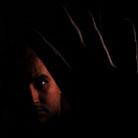
It's Great, but....
I like it 
but...
The character himself looks like he was enlarged a great deal (Pixelated). Maybe in future submissions, starting out bigger and not doing a whole lot of enlarging would make a awesome pic an even greater one.
but...
The character himself looks like he was enlarged a great deal (Pixelated). Maybe in future submissions, starting out bigger and not doing a whole lot of enlarging would make a awesome pic an even greater one.
-
Coldwinter
- DCEmu Freak
- Posts: 63
- Joined: Tue Jun 25, 2002 4:54 pm
- Location: On the Top of a Icy mountain
- Has thanked: 0
- Been thanked: 0
ok
Criticism Makes you a better artist then u can see where u went wrong
Hmmmm i wonder where that came from.......
http://cool.lindata.se/coldwinter/
Hmmmm i wonder where that came from.......
http://cool.lindata.se/coldwinter/
-
NeonGenesis
- Respected Artist

- Posts: 1015
- Joined: Sat Apr 27, 2002 3:46 pm
- Has thanked: 0
- Been thanked: 0
- Contact:
Another cool picture, my friend. Again, you use a color scheme that is attractive, but not too flashy as to impede upon stuff placed on top of it.
Here's my criticism
1)Use a higher color-depth: I've only seen two of your pictures, and this seems to be something that would greatly increase the quality of your work. Though the color schemes look good, the colors aren't blending together well due to low color depth, hence creating defined borders on the edge of each color, which isn't a good thing. Easy enough to fix, though.
2)Lack of crispness and resolution: First off, a higher res image allows for higher detail, and higher detail makes an image look good. Also, in this picture, everything appears a bit blurred, and it looks to me like you just ran a soften filter over the whole thing. It lacks a crispness to the edges, which detracts from the quality.
Overall, again, great picture. You've got a good sense of color schemes and layout, but work on keeping your images high-res, high color, crisp, and detailed.
Hope this helps, and keep up the good work.
